The number that decides whether a metal sign works is not its overall size — it is the height of the capital letters. A four-foot panel with three-inch text is invisible from across a parking lot, and a small plaque with oversized type looks cramped. Sign shops size letters the same way every time, using a simple relationship between letter height and how far away people need to read from. Once you know the distance, the height falls out of it, and the panel gets built around the letters rather than the other way around.
The ten-feet-per-inch rule, and what it actually promises
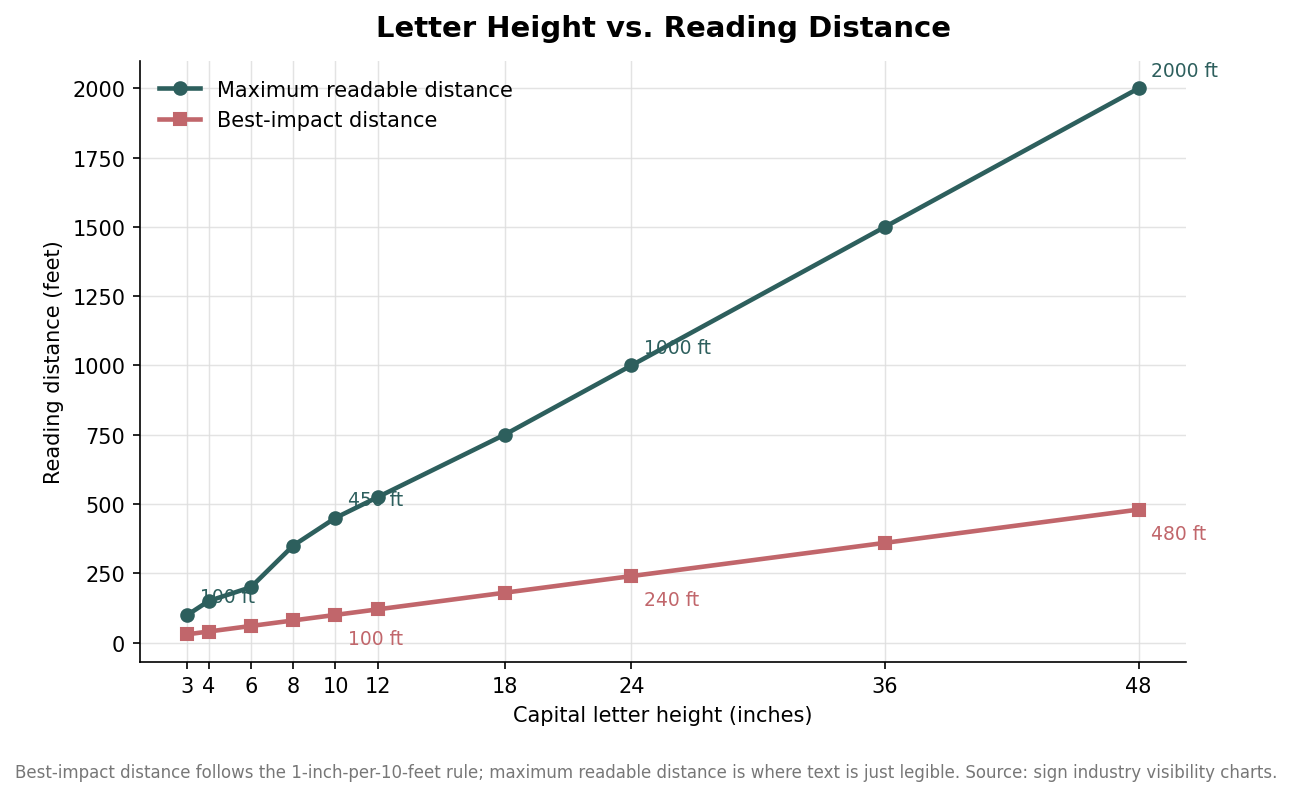
The working rule across the sign trade is that every inch of capital letter height buys about ten feet of comfortable reading distance. Three-inch letters read well at roughly 30 feet, six-inch letters at 60, ten-inch letters at 100, and so on in a straight line. The U.S. Manual on Uniform Traffic Control Devices uses effectively the same ratio for roadway signs, about one inch of letter height for every ten feet of viewing distance. It is a rule of thumb rather than a law of physics, but it has held up because it builds in a margin for imperfect eyesight, glare, and quick glances.
There is a second, longer distance worth understanding: the maximum readable distance, where text is still just legible but no longer has any punch. That distance runs well past the comfortable-impact figure. Six-inch letters that read with impact at 60 feet remain barely legible out to about 200 feet, and 24-inch letters stretch from a 240-foot impact distance to roughly 1,000 feet at the edge of legibility. Design to the impact distance when you want the sign to land; treat the maximum only as the point past which the sign is effectively decorative.
Match the height to where the sign will actually live
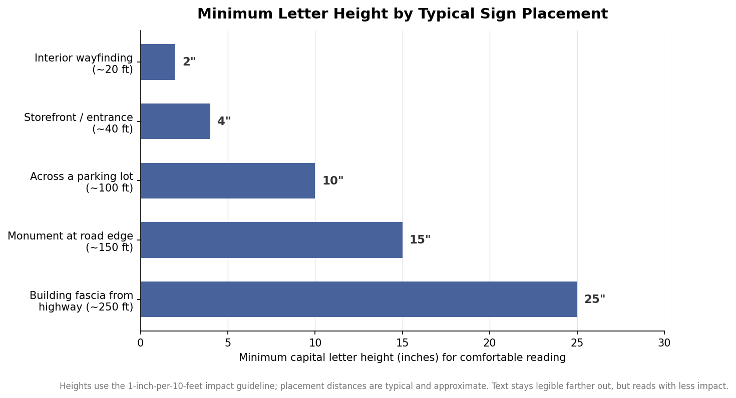
The cleanest way to size a sign is to pace out the real viewing distance and divide by ten. Interior wayfinding read from around 20 feet wants roughly two-inch caps. A storefront or entrance sign taken in from about 40 feet wants four inches. A sign meant to be read across a 100-foot parking lot needs ten-inch letters, a monument sign set 150 feet back from the road needs about fifteen, and building lettering seen from a highway 250 feet out climbs to two feet or more. Those figures are the comfortable minimums; if the sign competes with visual clutter or gets read at an angle, size up rather than down.
Distance is the dominant variable, but not the only one. High contrast between the text and background — dark letters on light, or light on dark — extends effective range, while low-contrast pairings shrink it. A bolder, wider typeface reads farther than a thin or condensed one at the same cap height, which is exactly why highway lettering is heavy and open rather than elegant. If you are pushing a message to the far end of its distance, contrast and font weight are the two free levers before you pay for more height.
Moving traffic changes the math
A sign read on foot and a sign read from a moving car are different problems. A driver has roughly two to three seconds to find, read, and act on a sign without pulling too much attention off the road, and the faster the vehicle, the more of that budget disappears before the eye even lands on the text. The practical answer is fewer words, heavier letters, and more height than the static distance alone would suggest. As a rough metric version of the same rule, plan on about 100 millimeters of letter height for every 100 meters of reading distance, then add height as speed climbs. For a fast approach, err toward the larger end of any range you are choosing between, and keep the message to the few words a driver can absorb in a single glance.
Size the panel around the letters, not the letters around the panel
Once the cap height is set, the overall panel follows from it. Capital letters occupy only part of a text line once you account for descenders and breathing room, so a line of ten-inch caps needs meaningfully more than ten inches of vertical space, and every added line multiplies that. Leave a clear margin around the text block — crowding letters to the panel edge kills legibility faster than shrinking them does — and remember that the trim, mounting holes, or standoff hardware all live in that margin. Working in this order avoids the common mistake of buying a panel size first and then discovering the message will not fit at a readable height.
The material has to keep up with the size, too. As a panel grows, a thin gauge that felt rigid at plaque scale starts to flex and oil-can in wind, so larger outdoor signs move to thicker aluminum, an aluminum-faced composite panel, or added bracing. That is a separate decision from letter height, but it is driven by the same starting point: pick the size the reading distance demands, then choose a substrate and thickness that will hold that size flat and steady where it hangs.
A quick way to get it right
Before ordering, pace off the farthest point people will realistically read the sign from, divide that distance in feet by ten, and use the result as your minimum capital letter height in inches. Bump it up for low contrast, thin fonts, sharp viewing angles, moving traffic, or a message longer than a few words. Then build the panel around that letter height with real margins, and match the material thickness to the finished size. Sizing in that sequence — distance, then letters, then panel, then material — is how a metal sign ends up both readable and right the first time.