Artwork for custom metal signs works best as a vector logo, exact brand colors and a short list of what each sign must say, because metal shows every soft edge and color shift. Get Custom Metal Signs turns that into a free mockup within 24 hours, so you can check layout, holes and color on screen before a single sign is made.
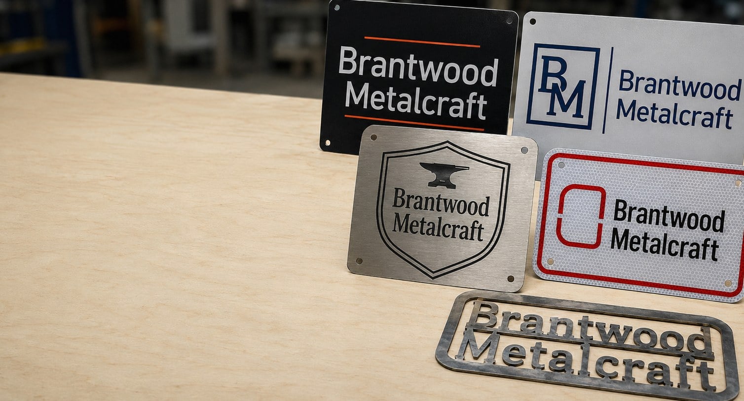
- Vector files (AI, EPS, SVG or vector PDF) print and engrave with the cleanest edges on metal signs
- Engraved and laser-cut metal signs need solid shapes, not photos or soft gradients
- Free mockup within 24 hours, with unlimited revisions until the proof is right
- Every sign in a run of 12 or more can carry different text from the same template
- Nothing to pay until you approve the design, and standard turnaround is about 2 weeks after approval
What file format is best for a custom metal sign logo?
A vector file is the best format for a custom metal sign logo: AI, EPS, SVG or a PDF exported from design software with the shapes intact. Vector artwork is built from paths rather than pixels, so the same logo stays crisp on a small brushed aluminum plaque and on a large Dibond storefront sign.
Raster files such as JPG and PNG can work for full-color printed metal signs when they are large and sharp, but they cannot be engraved or laser-cut directly. Those methods follow outlines, and a pixel image has no outlines to follow until someone traces it.
| File type | Printed signs | Engraved signs | Laser-cut steel |
|---|---|---|---|
| AI, EPS, SVG, vector PDF | Best | Best | Required |
| Large, sharp PNG or JPG | Usable | Needs tracing | Needs tracing |
| Small web logo or screenshot | Blurry | Needs tracing | Needs tracing |
| Word or PowerPoint file | Reference only | Reference only | Reference only |
If you are not sure what you have, ask the person or agency who designed the logo for the original working file. Send whatever you can find; the mockup will show whether it holds up.
How do brand colors look when they are printed on metal?
Brand colors on metal signs look closest to your standard when you send exact color codes, not a screenshot. A Pantone reference, or the CMYK values from your brand guide, gives the print team a fixed target. Colors picked from a website are built for glowing screens and often print slightly duller on metal.
The surface also changes the result. On white-coated aluminum and Dibond, colors look much like they do on paper. On brushed aluminum, any area left unprinted shows the bare grain of the metal, which reads as a silver tone and can make dark colors look cooler and light colors look faint.
- Bold, saturated colors read well on every surface, especially outdoors.
- Pale pastels and light grays can disappear on brushed metal; give them a white underlayer or a coated base.
- Metallic inks in a logo are usually best matched by letting the real metal show through instead.
Tell Get Custom Metal Signs which colors are non-negotiable, and the mockup will flag any that need a different base or finish.
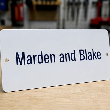
Does artwork for engraved or laser-cut metal signs need to be different?
Yes. Artwork for engraved and laser-cut metal signs has to be built from solid shapes, because both methods remove metal along a line rather than laying down ink. Photos, drop shadows, glows and soft gradients have no place to go on an engraved plaque or a laser-cut steel silhouette.
For engraving, keep lines and small text bold enough to survive the cut. Fine hairlines and very thin script fonts can fill in or break up. Text set in a sturdy serif or a clean sans-serif engraves far more clearly than a delicate signature-style face.
Laser-cut steel signs add one more rule: every piece must stay connected. Letters such as O, A, B and R have inner islands that would fall out when cut. Designers solve this with bridges, small tabs that hold the center in place, the way a stencil does. A good laser-cut steel layout also avoids long, thin spurs that could bend.
- Convert all text to outlines in the final file.
- Merge overlapping shapes into one clean outline.
- Mark which areas are cut out and which stay solid.
- Approve the bridges on the mockup before production.
What are bleed, safe zone and mounting holes, and why do they matter on a metal sign?
Bleed, safe zone and mounting holes are the three layout margins that decide whether a custom metal sign looks finished or cramped. Bleed is background color that runs past the trim edge so no bare strip shows after cutting. The safe zone is the inner margin where text and logos belong, clear of the edge.
Mounting holes are the margin most often forgotten. A sign that will be screwed to a wall, post or fence needs holes, and those holes need clear space around them. A hole that lands on the first letter of a business name, or on a fire lane arrow, is the classic first-order mistake.
- Keep background art running to the edge, past the trim line.
- Keep text and logos well inside the edges and away from the corners.
- Tell Get Custom Metal Signs how each sign will be mounted: screws, posts, rivets, adhesive or a hanging chain.
- Rounded corners change the safe zone; let the layout account for them.
The mockup shows holes, corners and margins drawn in, so you can spot any clash before you approve.
How do I set up a metal sign order where every sign has different text?
Set up a variable-text metal sign order with one master design plus a spreadsheet that lists the text for each sign. The master holds everything that stays the same, such as logo, colors, border and font, and the spreadsheet holds what changes, such as room numbers, names, titles, lot numbers or directions.
This is how a run of 12 or more custom metal signs can include a different message on every sign without a separate design fee for each one. It also prevents the drift that happens when signs are designed one at a time and fonts or spacing slowly change.
- Use one row per sign and one column per text field.
- Write the text exactly as it should appear, including capital letters and punctuation.
- Find the longest entry in each column, since that line sets the font size for the whole set.
- Add a quantity column if some signs repeat, such as several identical no-parking signs.
Get Custom Metal Signs will mock up the longest and shortest entries so you can see the extremes before every sign goes to production.
What should I check on a metal sign proof before I approve it?
Check every word, every color and every hole on a metal sign proof before you approve it, because approval is the moment production starts. A proof is the last point at which a change costs nothing, and after approval the metal is printed, engraved or cut exactly as shown.
- Spelling and names: read each line aloud, and have a second person read it too. Names, street numbers and phone numbers are where errors hide.
- Size and readability: confirm the overall dimensions and that the main message reads at the distance people will see it.
- Colors: compare the proof against your brand codes, not against your monitor’s impression of them.
- Material and finish: make sure the proof names the metal you expect, such as aluminum, Dibond, brushed aluminum or steel.
- Holes and corners: check placement against your mounting plan.
- Quantities: on variable-text orders, match the proof list to your spreadsheet line by line.
Revisions are unlimited, so ask for another round whenever something looks off. Nothing is paid until you approve the design.
What artwork mistakes cause the most problems on custom metal signs?
The artwork mistakes that cause the most problems on custom metal signs are low-resolution logos, too much text, low contrast and outdoor colors chosen without the setting in mind. Each one is easy to fix at the mockup stage and impossible to fix once the sign is made.
- Logos pulled from a website or social profile: these are tiny and blur when enlarged to sign size.
- Paragraphs of copy: a sign is read in seconds; keep the message to a headline and one supporting line where you can.
- Low contrast: gray on silver or navy on black may look stylish on screen and vanish outdoors.
- Thin fonts on engraved plaques: delicate strokes lose definition in metal.
- Ignoring the wall: a dark sign on a dark brick wall needs a light border or a contrasting frame to stand out.
- Safety signs designed like ads: parking and safety signs should follow the plain, familiar look drivers already recognize.
When in doubt, send the rough idea and a photo of where the sign will hang. The free mockup is the place to test bold choices safely.
Frequently asked questions
Can I send a hand sketch as artwork for a custom metal sign?
A hand sketch is a perfectly good starting point for a custom metal sign. Photograph or scan the sketch, note the wording, colors and approximate size, and send it with any logo files you have. Get Custom Metal Signs builds the clean digital layout and returns a free mockup within 24 hours, which you can revise as many times as needed before approving.
Why does my logo look blurry when it is enlarged for a metal sign?
A logo looks blurry on a metal sign when the file is a small pixel image, such as a web graphic or a social profile picture, stretched far beyond its original size. Pixels simply grow into visible squares. Ask your designer for the original vector file, or send the largest version you have so the team can judge whether it needs tracing.
Should text be converted to outlines before sending metal sign artwork?
Converting text to outlines is the safest way to send finished metal sign artwork, because it locks the exact font shapes even if the receiving computer lacks that font. Keep an editable copy with live text too, since outlined words cannot be retyped. If you cannot convert the text, simply name the fonts used so the layout can be matched.
Can a photograph be used on a custom metal sign?
A photograph works well on a full-color printed metal sign, particularly on white-coated aluminum or Dibond, as long as the original image is large and sharp. Photos cannot be engraved or laser-cut, because those methods follow solid outlines. Get Custom Metal Signs will point out on the mockup whether a photo has enough detail for the sign size you want.
How do I match a Pantone color on a metal sign?
Matching a Pantone color on a metal sign starts with sending the exact Pantone number from your brand guide, not a color picked from a screen. Say which surface you want, because the same ink reads differently on white-coated aluminum than on brushed aluminum. The mockup notes the target color so you can confirm it before production starts.
Does brushed aluminum change how a printed logo looks on a metal sign?
Brushed aluminum changes a printed logo on a metal sign wherever the art leaves the metal bare, because the grain shows through as a soft silver tone. Dark colors look cooler and pale colors can fade into the surface. Get Custom Metal Signs can add a white underlayer beneath chosen areas so those colors stay bright and true.
What happens to small text on an engraved metal plaque?
Small text on an engraved metal plaque can lose definition when the strokes are thinner than the engraving tool can hold cleanly. Very fine script and light-weight fonts are the usual culprits. Choosing a sturdier font weight or making the line a little larger keeps every letter crisp, and the mockup shows how the text sits before anything is engraved.
Can I reuse artwork from a previous metal sign order for a reorder?
Reusing artwork from a previous metal sign order is the easiest way to keep new signs identical to the ones already installed. Get Custom Metal Signs can start from the approved design, so you only send what changes, such as new names or room numbers. A fresh mockup still comes back for approval, which protects the match before production.
Who is responsible for spelling errors on an approved metal sign proof?
Spelling on a metal sign proof is the buyer's final check, because approving the proof tells production to make the signs exactly as shown. That is why careful proofreading matters so much, ideally by two people reading every name and number aloud. Revisions are unlimited and free before approval, so request changes whenever anything looks wrong.
Can I see a metal sign mockup on a photo of my wall or storefront?
Seeing a metal sign mockup against your real wall or storefront is a smart way to judge size and contrast. Send a straight-on photo of the spot along with rough measurements, and Get Custom Metal Signs can place the design in that setting. Brick, glass and painted walls all change how a sign reads from the street.
How should QR codes be set up on a custom metal sign?
QR codes on a custom metal sign scan most reliably when printed dark on a light, matte background with a clear quiet margin around the code. Avoid placing them on reflective brushed areas or near mounting holes. Send the destination link rather than an image of the code, so a fresh, sharp version can be generated and tested at the proof stage.
Get a free mockup for your metal signs
Send your logo or idea and the quantity you have in mind. Get Custom Metal Signs returns a free mockup within 24 hours, you approve the design before anything is produced, and standard turnaround is about two weeks with faster options available. Get a custom quote.